Vegworks Graphics Logo Metamorphosis
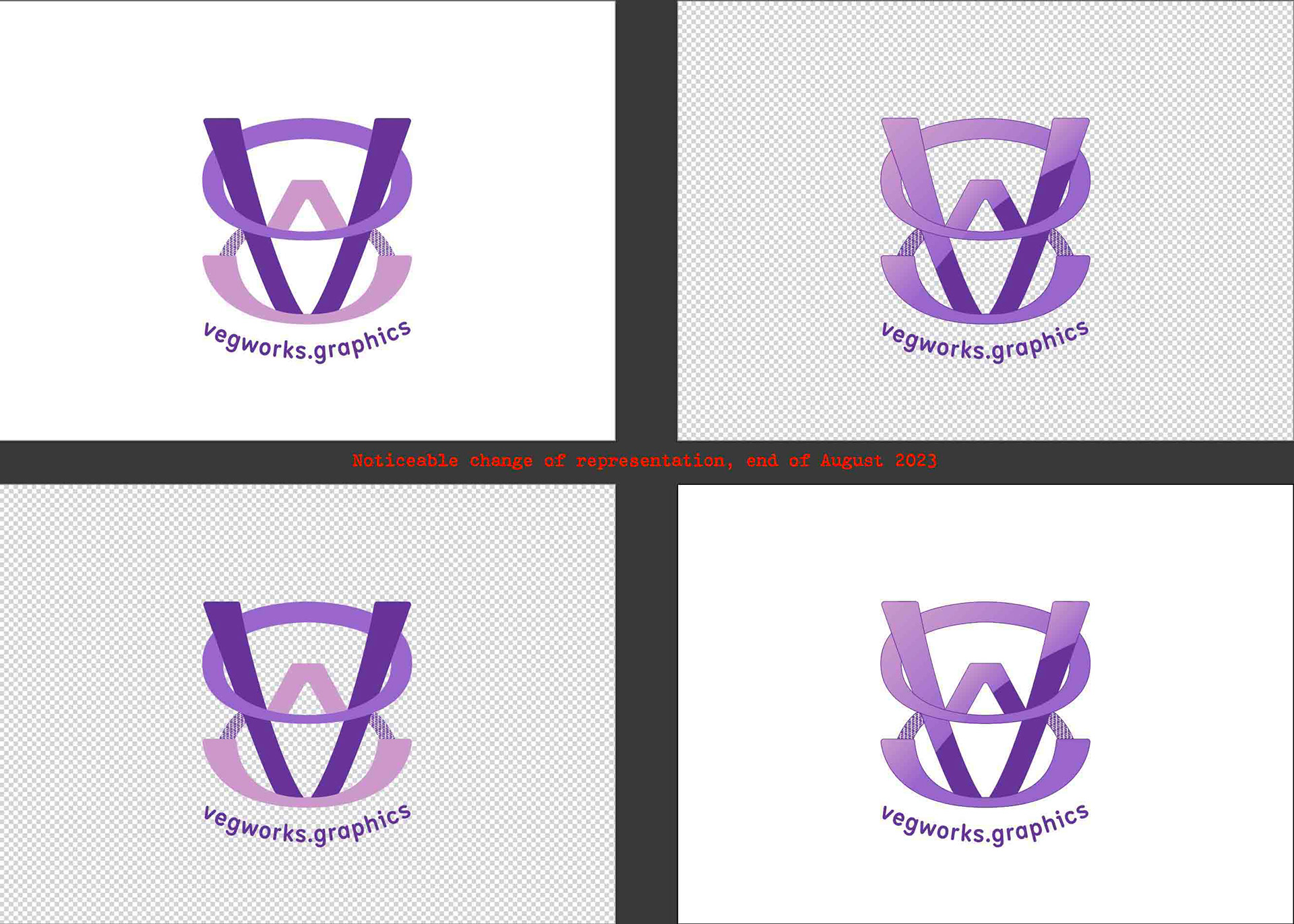
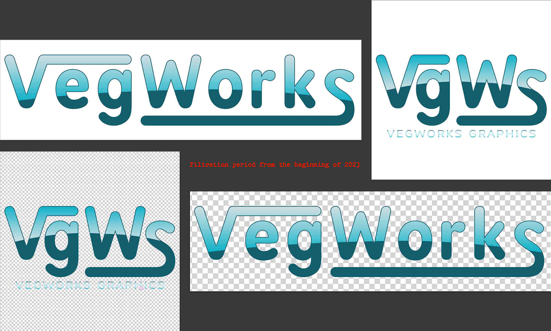
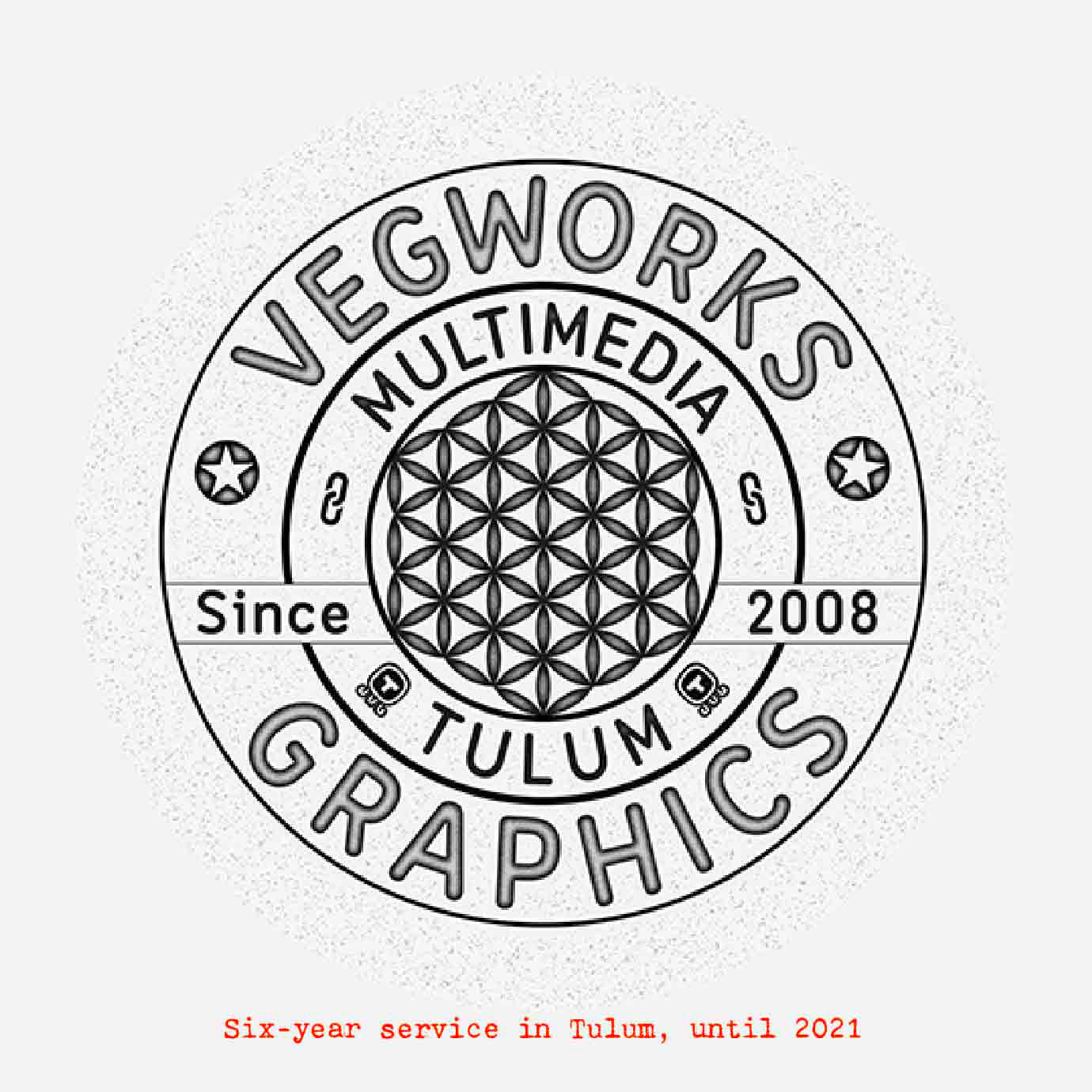
After Vegworks Graphics “paid tribute” to Tulum's society for about six years, until the end of 2021, with an interesting flower of life, with the city's nomination in the simplified logo and after a “filtration” period in the one that has been in place since the beginning of 2023, today faces a quite noticeable change in its representation.
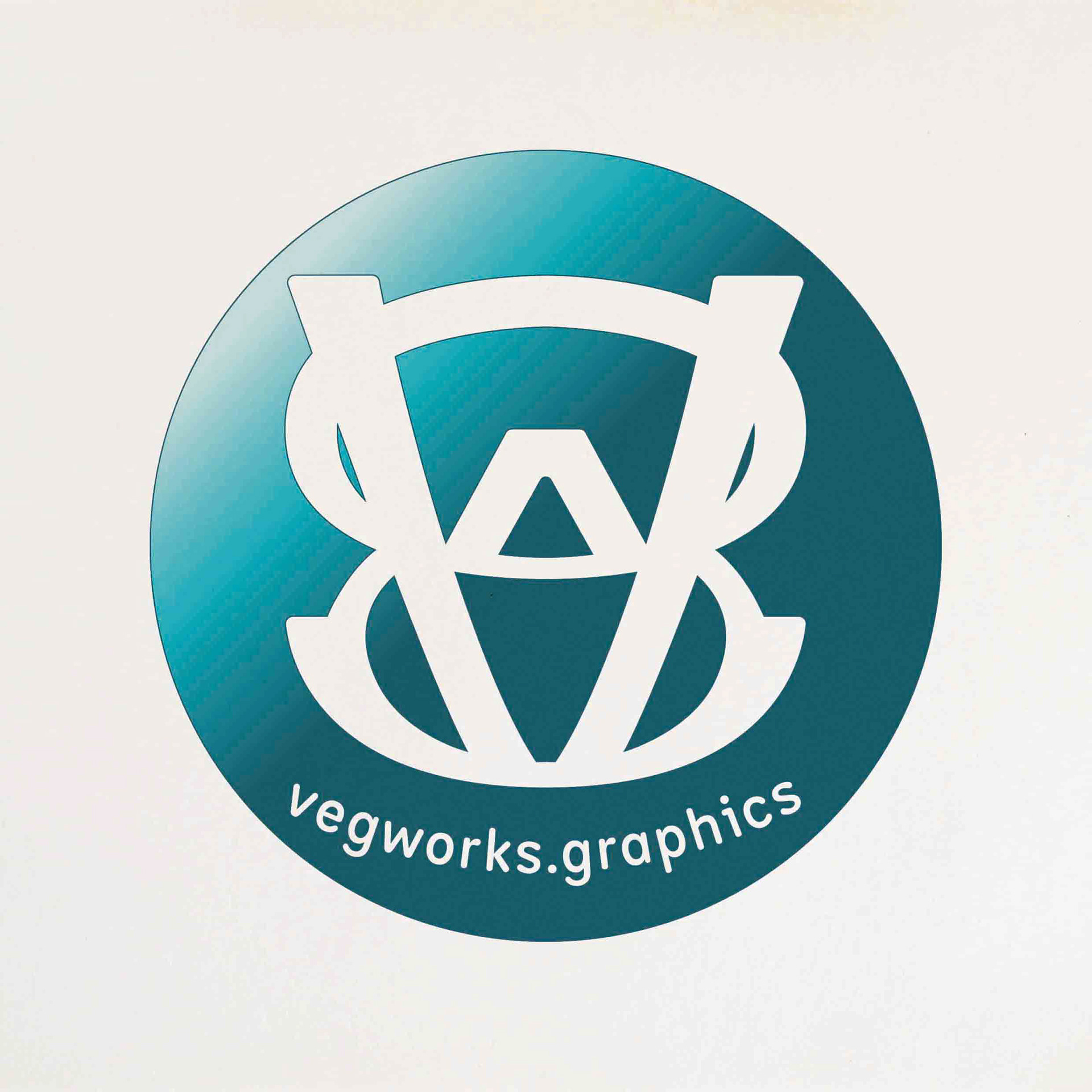
From a certain perspective, the logo represents two rings, within which is letter “v” in charge of the broader balance for the meaning. The letter “w” in the center of the image, or on the “v” as it can also be distinguished, acts as a catalyst for the entire structure.
The letters “g” and “s”, which are the rings, are interconnected by two "energetic" representations on the graph, one on the left and one on the right.
Development was carried out in lowercase letters.
Feedbacks are appreciated.
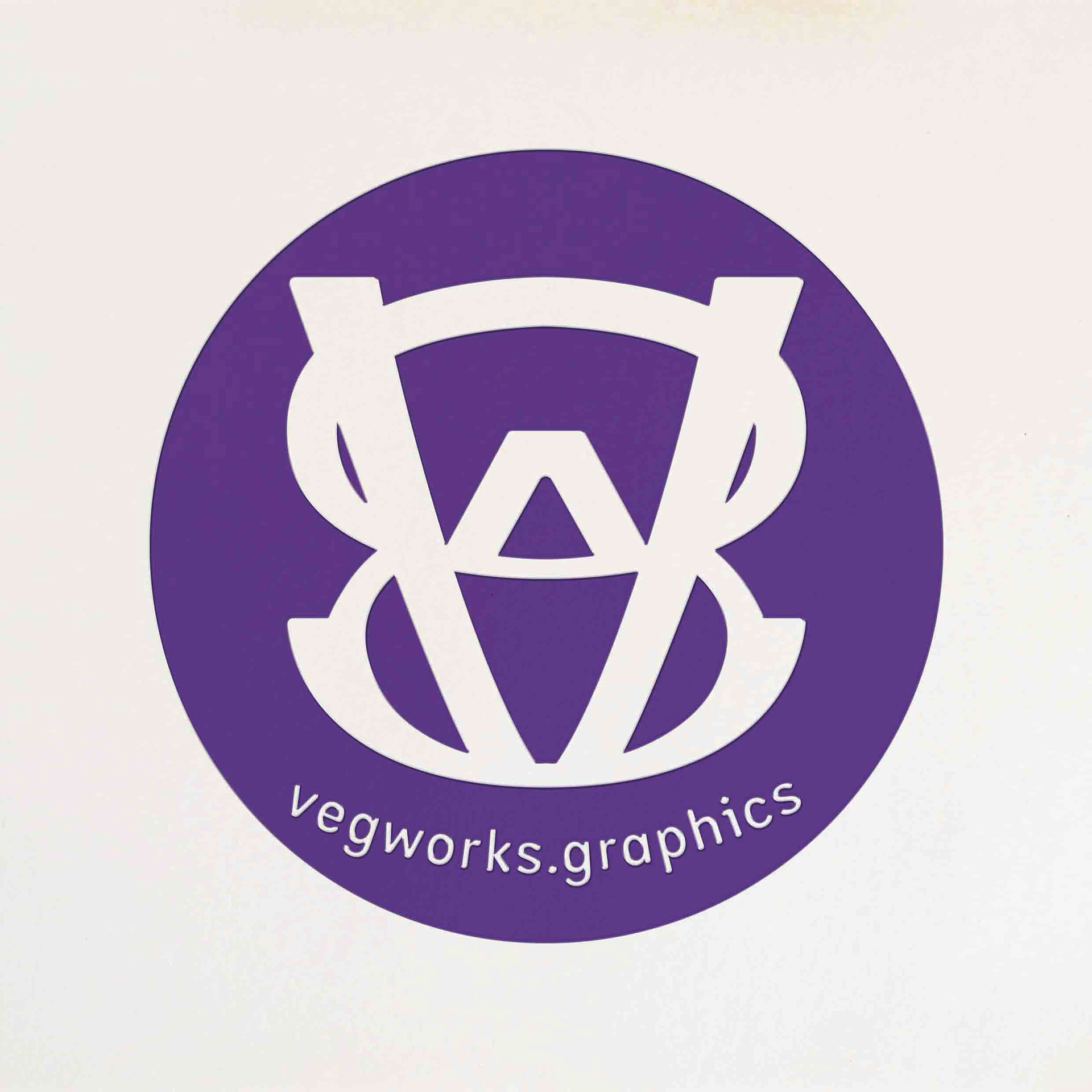
Status of August 25, 2023
Status of August 25, 2023